[Redacted] assessments tool is a comprehensive document management system designed to support structured organization and flexible handling of complex regulatory information. It enables efficient execution of core tasks such as searching, viewing, downloading, and commenting review, while also offering advanced capabilities to streamline internal workflows, including:
Browsing categorized records
Creating and managing electronic records
Managing file attachments individually
Performing full-text search across content and metadata
Research
The problem
The team frequently ran into issues analyzing and interpreting data to make informed decisions. They needed a clearer, more structured way to identify relevant threats, share information across appropriate channels, and support strategic decisions around cyber defense and deterrence while navigating the global cyber landscape.
Discover and define
Business Challenges
Overwhelming Complexity Difficulty navigating large volumes of documents with deeply nested structures. Struggle to distinguish between similar versions, especially when naming conventions aren’t clear
Inconsistent Metadata Usage Users apply tags or categories inconsistently, leading to poor searchability. Lack of guidance on how to structure metadata for regulatory use cases
Poor Search and Retrieval Hard to find specific documents quickly without knowing exact keywords. Filters may not reflect how users think or work with regulatory content
Version Control Confusion Uncertainty about which version is current or approved. Increased risk of working from outdated or draft content
Ideate
Wireframes
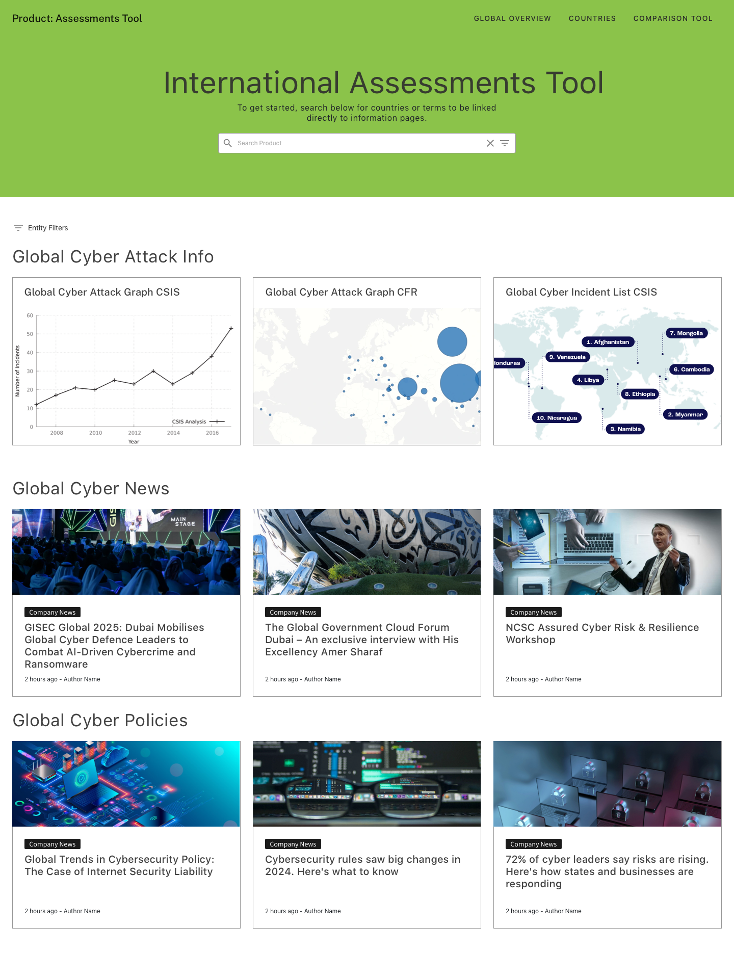
Home page
Selected
What worked
clear hierachy about the tool and its purpose
easy to view grid, allowing for as many cards and data access as possible right up front
incorporation of site wide search functionality first and foremost
What Didn't worked
original content was not useful below the banner. Operation scores was too specific of metric for such importance for occupying most of the homepage.
while the grid worked, not having a visual break led to the page being percieved less as a homepage and more as an dashboard which missed the mark and intent.
the country filters search was too specific for page as users wanted a broader scope to search all relevant data to their query.
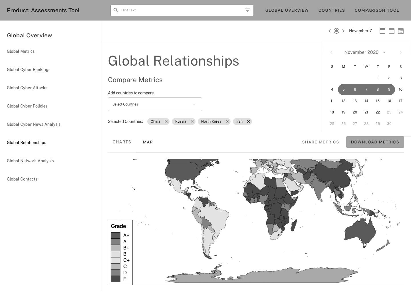
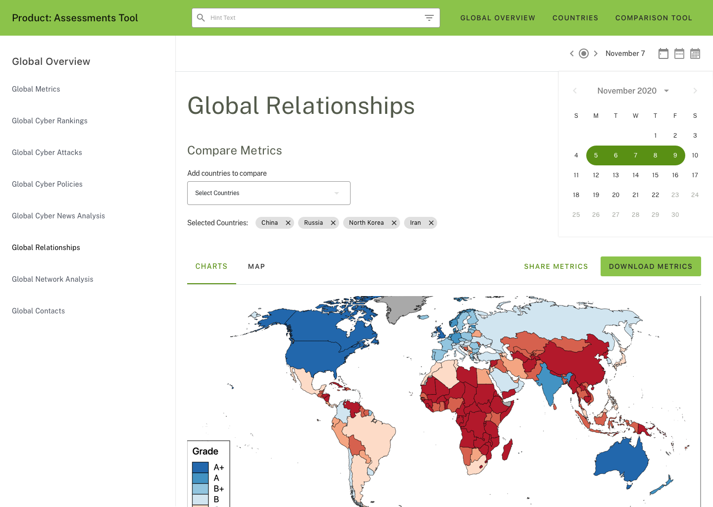
Global Relationships
Selected
What worked
sidebar navigation allowed for easy navigation through all the sections within the Global Overview page of the website
clear and present page heirachy
ease and presence of filter options for a variety of metrics
What Didn't worked
in efforts to minimize page size, consolidating the same information into a grid format condesed the information to much
the map visualization becomes harder to read
design led to feedback concerns over too much white space present when viewing on screens
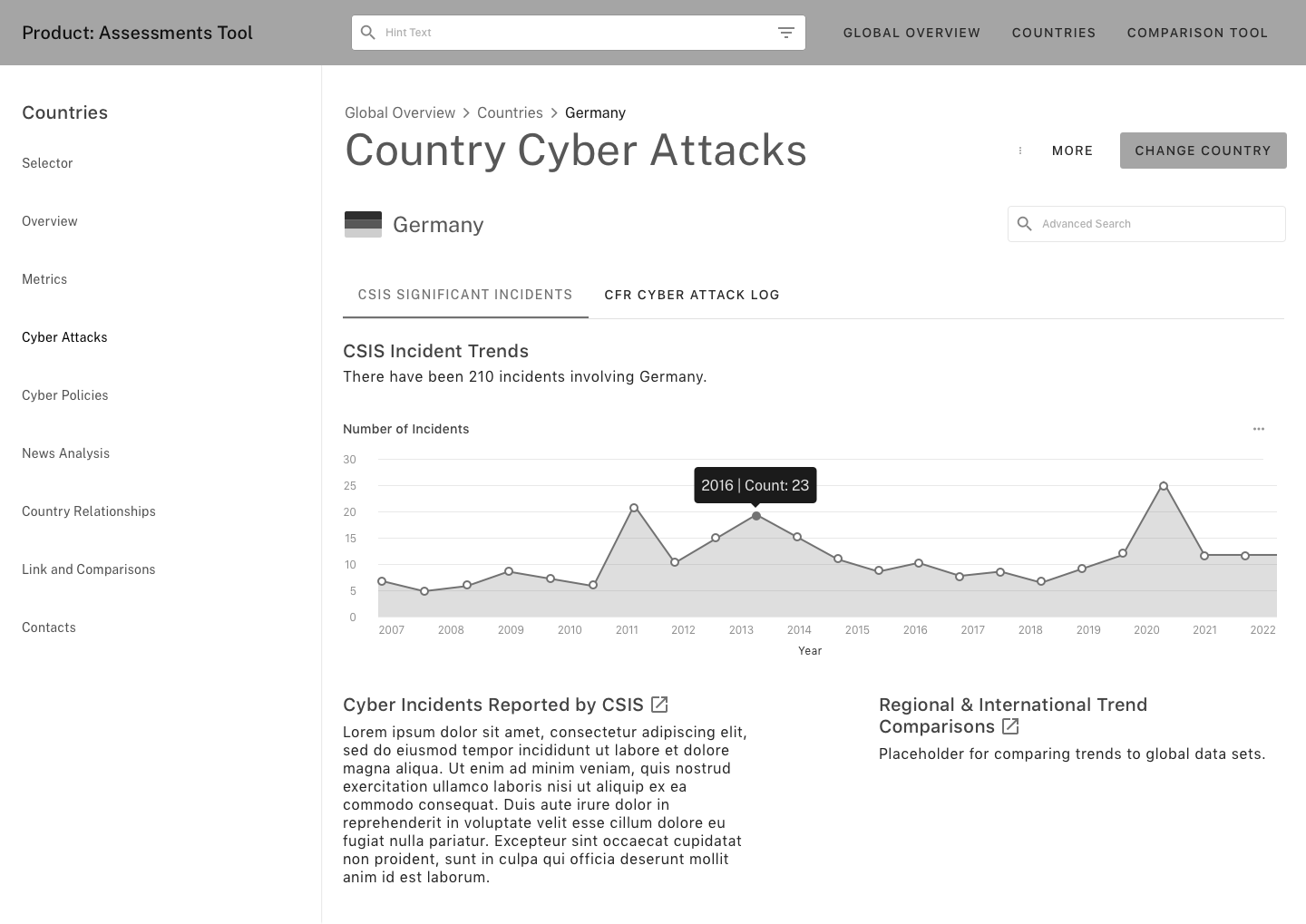
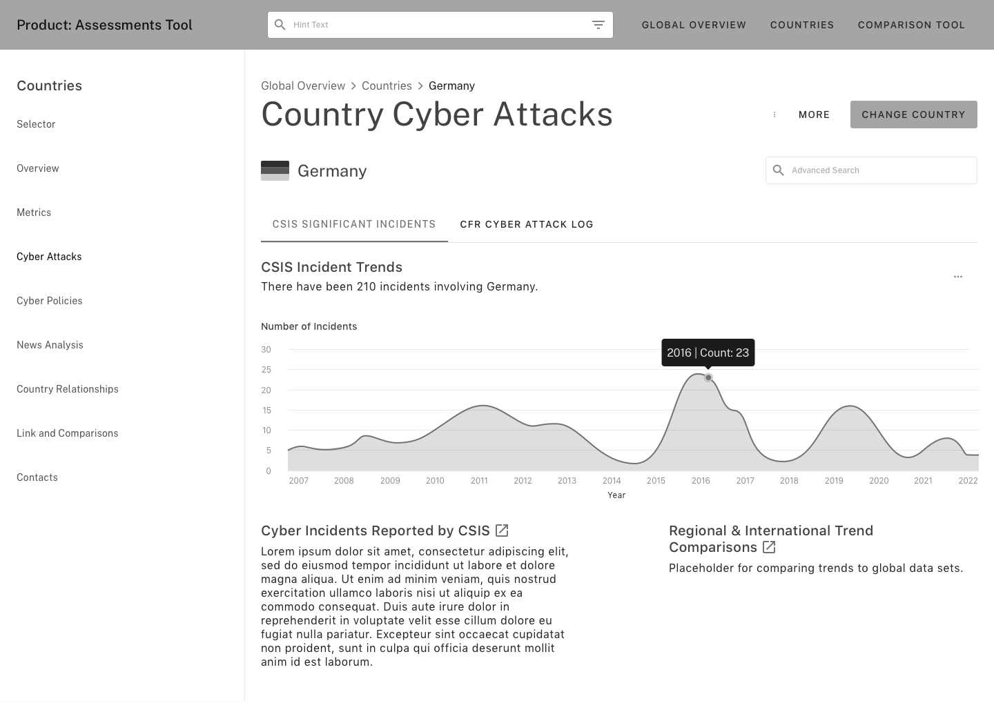
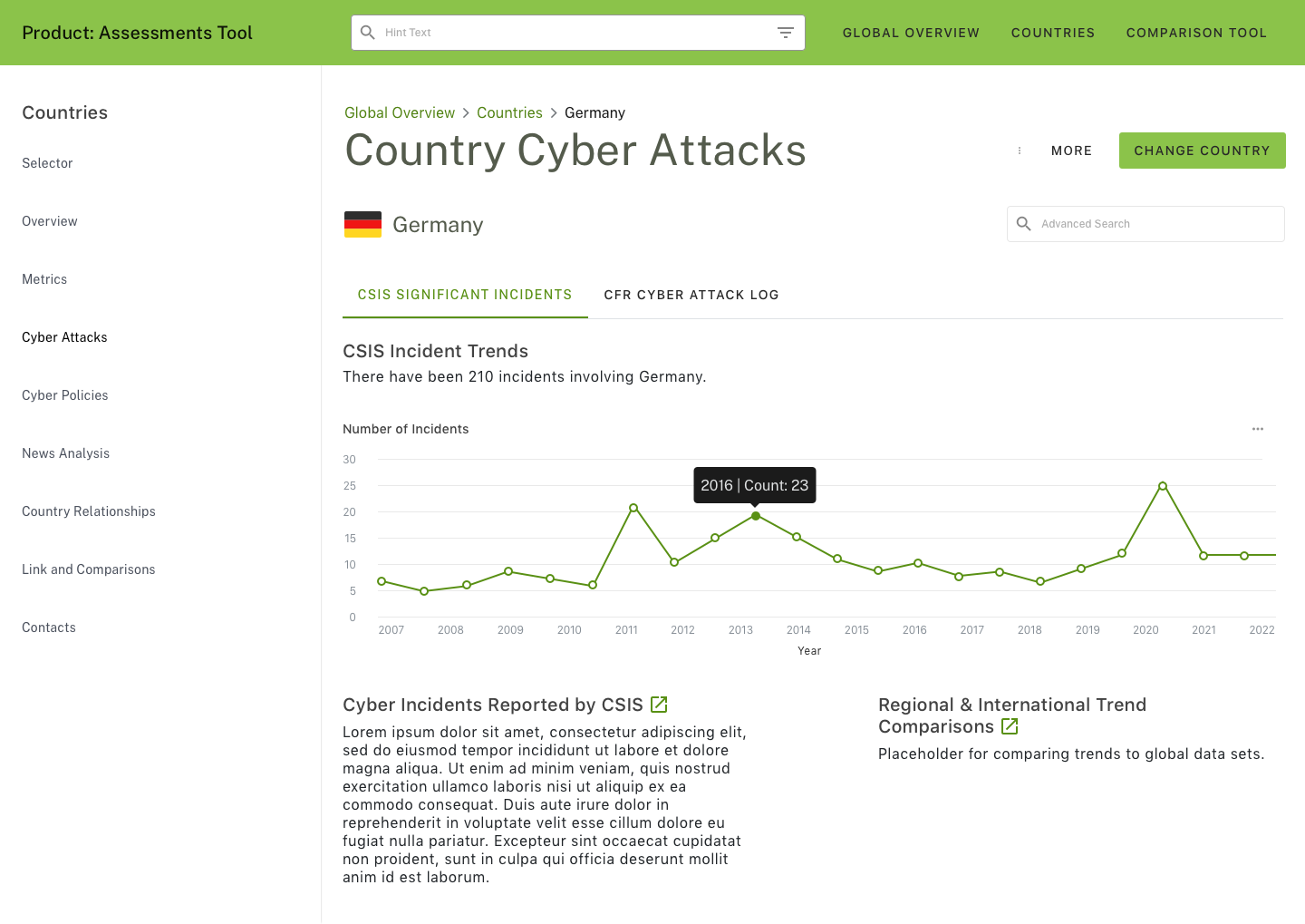
Country Cyber Attack - Significant Incidents Page
Selected
What worked
sidebar navigation allowed for easy navigation through all the sections within the Global Overview page of the website
clear and present page heirachy
ease and presence of filter options for a variety of metrics
easily fount chart data points for interactions
What Didn't worked
while visually appealing, this chart type led it to become more diffucult to interact with.
without the presence of vector points, the data presented in the tooltips was more freeform and led to overshooting data points with the cursor
without the vector points the chart initally lead to the assumption of it being just a visual piece as instead of its' intended goal of being an interactive data chart